Event model
The Event model represents an event in the calendar. The most basic instance consists of date, startTime and endTime.
It also contains some hidden logic that allows the calendar to perform validations and store some meta data without exposing this data to you, so the objects you pass to the calendar remain as you added them.
Setting or adding events
To add your events to the calendar simply pass an array with your events to the events prop of the calendar.
<template>
  <v-scheduler :events="events"/>
</template>
<script>
  export default {
    data() {
      return {
        events: [
          {
            date: new Date()
          },
          {
            date: new Date(),
            startTime: "13:00",
            endTime: "15:00",
          }
        ]
      }
    }
  }
</script>
You can pass events with just a Date object.
If there is no startTime the event will show on the all day section of the week and day views. The startTime is also used to sort events with the same date on the month view.
If you pass an event with a startTime but without an endTime you will get an error.
The format for the times is "HH:mm", using 24-hour.
TIP
Any event you later to the array, as well as any event created using the Event dialog, will appear in the calendar automatically.
Custom attributes
If you want to add more attributes to your events, like a name, simple add them to each event object.
// ...
export default {
    data() {
      return {
        events: [
          {
            date: new Date(),
            startTime: "13:00",
            endTime: "15:00",
            name: "Date with David",
            comments: "MUST bring chocolate.",
            customAttribute: "I'm a custom attribute"
          }
        ]
      }
    }
}
// ...
Setting the event display
By default the events on the calendar display only the startTime if any.
If you want to display something else for each event, set the event-display prop on the calendar instance (check available props).
The props takes a String as the key for the attribute you want to display. It can also take a callback function in case you need more control. This callback receives the event as a parameter and should return a String with the value you want to display.
Using a string as key:
<template>
  <v-scheduler :events="events" event-display="name" /> <!-- Using the custom attribute 'name' as display key. -->
</template>
<script>
  export default {
    data() {
      return {
        events: [
          {
            date: new Date(),
            startTime: "13:00",
            endTime: "15:00",
            name: "Date with David",
            comments: "MUST bring chocolate.",
            customAttribute: "I'm a custom attribute"
          }
        ]
      }
    }
  }
</script>
Using a callback function:
<template>
  <v-scheduler :events="events" :event-display="eventDisplay" /> <!-- Using a callback function. -->
</template>
<script>
  export default {
    data() {
      return {
        events: [
          {
            date: new Date(),
            startTime: "13:00",
            endTime: "15:00",
            name: "Date with David",
            comments: "MUST bring chocolate.",
            customAttribute: "I'm a custom attribute"
          }
        ]
      }
    },
    methods: {
      eventDisplay(event) {
        return event.name + ' - ' + event.comments;
      }
    }
  }
</script>
Event dialog
The default, basic dialog looks like this:

If the user clicks on a date on the month view the dialog will populate the Date and leave the Start Time and End Time empty.
If the user clicks on a time block on the week or day views the dialog will populate the Date, the Start Time and the End Time.
Dialog settings
To change any setting of the dialog, pass an object with your settings to the event-dialog-config prop of the calendar.
These settings are not global.
Remember that these settings work per instance only.
| Setting | Description | Type | Default |
|---|---|---|---|
| title | Sets the dialog title. | String | 'Create event' |
| inputClass | Additional classes for the dialog inputs. Classes are added to input parent, not the input itself. | String | null |
| overrideInputClass | By default classes set with inputClass are appended to the default class. This setting removes default classes. | Boolean | false |
| createButtonLabel | Text for the Create button of the dialog. | String | 'Create' |
| enableTimeInputs | Toggles the startTime and endTime inputs. | Boolean | true |
| fields | Additional fields. | Array[Object]. Check Custom fields. |
Custom fields
Each field consists of the following attributes:
Input type support
Checkboxes, radio and selects are not supported yet. This will be fixed in the next release.
| Attribute | Description | Type | Default | Required |
|---|---|---|---|---|
| name | Sets the name of the html input. It should match the name of the custom attribute you want to set. | String | N/A | Yes |
| type | Sets the input type. Supports almost any HTML5 input type and textarea. | String | 'text' | No |
| label | Sets the input label. Defaults to the name attribute. | String | name attribute | No |
| showLabel | Shows/hides the input label. | Boolean | true | No |
| required | Adds/removes the required HTML attribute. | Boolean | false | No |
| value | Sets the initial input value. | Mixed | null | No |
Inline fields
You can group fields to display them inline (like the default time fields).
To do this, pass an object with a fields array and an optional label. Check the example below.
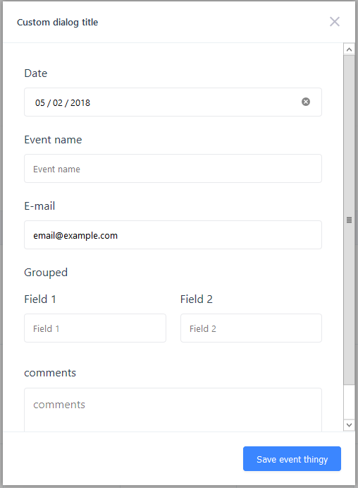
Dialog example
<template>
    <vue-scheduler :event-dialog-config="dialogConfig"/>
</template>
<script>
  export default {
    data() {
      return {
        dialogConfig: {
          title: 'Custom dialog title',
          createButtonLabel: 'Save event thingy',
          enableTimeInputs: false,
          fields: [
              {
                  name: 'name',
                  label: 'Event name'
              },
              {
                  name: 'email',
                  type: 'email',
                  required: true,
                  label: 'E-mail',
                  value: 'email@example.com'
              },
              {
                  label: 'Grouped',
                  fields: [
                      {
                          name: 'Field 1'
                      },
                      {
                          name: 'Field 2'
                      }
                  ]
              },
              {
                  name: 'comments',
                  type: 'textarea',
                  label: 'comments'
              }
          ]
        }
      }
    }
  }
</script>
This produces the following dialog: